For drawing the game scoreboard that shows the player fuel level, score and number of lives, I needed to be able to render text into the game screen. Text rendering in OpenGL is a problem for which no solutions exist that are both elegant and easy. At least not unless you use some kind of third-party library, but what would be the fun in that? ;-)
OpenGL text rendering on iOS: these are your options
Text rendering on iOS is one of these things you don’t even have to think about if you’re using only Cocoa API’s, but text rendering into an OpenGL ES2 context is a whole different story. OpenGL (the desktop version) has traditionally been extremely weak in the text rendering department, with only very limited support for drawing text using fixed-width bitmap fonts, by means of the now deprecated GLUT API. OpenGL ES2 is even less helpful, as it basically has zero support for text rendering. Need to display static or dynamic text in OpenGL ES2? You’re on your own…
Various options are available to get nice-looking text into an OpenGL ES2 game or application, all of them with their own set of upsides and downsides. At any rate, your application will have to do all the heavy lifting. These are your options (or at least the ones I’m aware of):
-
UILabel/UIView overlays
By far the easiest way to display text in an OpenGL ES2 based iOS application is to add
UILabelor otherUIView-based subviews to the OpenGL view. By styling the label or view as a transparent overlay, the text will blend in with the OpenGL-rendered content, and all Cocoa font/text styling facilities that can be used with regular UIKit controls will be available.This method has a few drawbacks that are particularly relevant to games. First of all, compositing UIKit views and OpenGL (typically
GLKit) views is quite slow, especially when a lot of independent labels are needed. A second drawback is that it will not be possible to apply special effects to the text labels, such as glow effects, rotating or wiggling individual characters of a label, etc. Third, UIKit overlays do not integrate well with rendering of the OpenGL ES 2 content, the text overlays will be rendered into their own off-screen buffer and composited by iOS, which makes it very hard (and, again, slow) to perform e.g. masking effects.Probably there are other downsides to using UIKit overlays that I don’t know about yet, but for most games the ones mentioned above are already likely to be fatal. For debugging purposes or applications where performance and custom rendering are not critical, it can be workable solution. The question is why you would want to use OpenGL for rendering such applications though.
-
Polygonal text
A very flexible but very inconvenient way to render text in OpenGL is to build individual character glyphs from native OpenGL primitives, which for OpenGL ES2 means (stips/fans of) triangles. Triangles can be textured, transformed, and using shaders the options for special effects are limitless. The biggest problem is how to generate the font geometry efficiently and accurately (preserving curves, font metrics, kerning, etc), which would involve discretization (triangulation) of the font glyphs, a highly specific and decidedly non-trivial task you really want to expedite to the font rendering facilities provided by the OS. Performance would likely be quite bad, and especially when rendering text at small sizes image quality will suffer from the lack of font hinting and antialiasing performed by native OS text rendering.
-
Render to texture
The third, solution for OpenGL text rendering is to use native OS text rendering facilities to draw text labels to OpenGL textures, and render them as textured quads. For static text, this approach can be perfectly acceptable: the labels will integrate nicely with the rest of your OpenGL-rendered content, and can be rendered with custom shaders. The most obvious problem with this method is when text labels are used for non-static text. Re-rendering the label to a texture every time the label text changes is slow, and tricks like trying to cache and combine smaller textures into larger ones (for example using individual label textures for the digits ranging from 0 to 9 and combining them to form larger numbers) will result in suboptimal image quality, because you lose proper font kerning. Another problem is when the amount of text to display is very large, which can quickly exhaust available texture memory (which in the case of devices using OpenGL ES2 typically means system RAM).
-
Font atlas
The last option I’ll discuss here is to use a font atlas: a specialized sprite atlas that packs rendered images for each font glyph into a single texture, and allows drawing glyphs using textured quads as if they were sprites. Besides the glyph images and glyph sprite frames, the font atlas also stores font- and glyph metrics and metadata to allow variable-width glyphs, kerning, glyphs that descend below the baseline, etc.
Font atlases have all the benefits of rendering labels to textures, without any of the downsides. Dynamic text only requires generating a new set of vertex- and texture coordinates, and only a single texture is needed to store the texture atlas. As far as I can tell, the only downside of using a font atlas for rendering text in an OpenGL application is implementation complexity: just to get a simple ‘hello world!’ to the screen you need a sprite atlas, a sprite packer, low-level access to font metrics and glyph data, and a way to render glyphs to textures. Luckily I’ve already spent some time implementing a sprite atlas class with sprite packing ;-)
From the inventory of options outlined above, I think it’s pretty obvious where this is going ;-). Over the last few weeks I’ve been working on a font atlas implementation that uses my sprite atlas and sprite packing classes, and utility classes that use it to create and render labels.
Text rendering basics
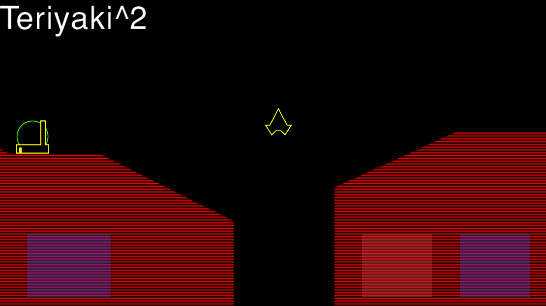
A surprising amount of font metrics are involved in rendering text using proportional fonts that may include descenders, glyphs with negative advances, glyps that overlap other glyphs, arbitrary glyph shapes, etc. The following illustration demonstrates the most important metrics:
The text itself is built from glyphs, the outlines of the shapes that make up the font. Most glyphs correspond to a single letter, but they can also contain diacritics (accents, mostly) that can be combined with other glyphs (e.g. é) or ligatures: glyphs representing a combination of letters, either stylistic (‘ff’, which looks better when the characters are connected), or as a spelling convention (for example ‘æ’).
Text sits on a baseline, the dark blue line in the figure. The baseline can be considered the x-axis of the coordinate system used to position glyphs. Glyphs don’t have to sit directly on this baseline, in fact, most of them don’t. The most obvious example are descenders, such as the letter ‘y’ in the figure. The glyph of this letter descends below the baseline, which means it has a negative y-offset relative to the baseline. Typically, characters with a rounded bottom also have a very small negative y-offset, to make them visually appear as if they sit directly on the baseline. The opposite of descenders are ascenders, or glyphs that extend above the height used for the majority of the glyphs, for example the ‘T’ in the figure. The difference between the highest ascender and the lowest descender, ie: the sum of the two vertical black arrows is the line height, which can be used to determine vertical spacing between lines of text.
The horizontal spacing between two glyphs is determined by the glyph advance, which is illustrated using the green arrows in the figure. The glyph advance can be seen as the horizontal distance over which to move the cursor after rendering a glyph, and should be interpreted as a nominal distance that does not depend on the context in which the glyph is used. When rendering nice-looking text though, the horizontal distance between two glyphs can depend on the shapes of the glyphs in the pair. For example, you can see the ‘e’ in ‘Teriyaki’ move under the roof of the ‘T’. In case the ‘T’ had been followed by an ‘i’ or an ‘l’, the next glyph would have to be rendered further to the right to avoid the character glyphs intersecting. The act of adjusting the horizontal distance between specific glyph pairs in order to optimize the appearance of the horizontal whitespace between them is called kerning. The light-blue arrow in the figure shows the kerning between the letters ‘T’ and ‘e’. For most glyph pairs (e.g. between the ‘k’ and the ‘i’) the kerning value will be 0, and the distance between the left-most points of the glyph pair will be equal to the font advance of the left-hand side glyph.
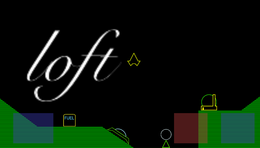
Every glyph in a piece of text has a bounding box, which in the figure above is defined as the red boxes. The bounding box origin does not sit on the baseline for glyphs with non-zero y-offsets, and it also does not need to have a zero or positive x-offset. The following example of a calligraphic font shows an extreme example of font glyphs with negative x-offsets:
The ‘f’ in the figure has a bounding box that almost fully contains all of the characters to its left and to its right. The bottom-half of the ‘f’ goes all the way below the preceding letter, which is achieved using a glyph bounding box with a negative x-offset, as illustrated by the red arrow. The final spacing between the ‘o’ and the ‘f’ are an interaction between the negative bounding box offset, the glyph advance for an ‘o’ glyph, and the kerning value for an (‘o’, ‘f’) glyph pair. As far as I know (ie: judging from my own observations) the font advance for each glyph is always a positive value, while glyph x-offsets and kerning values can also have negative values.
Font metrics in iOS
As you can see, a lot of things are needed to render nice looking text: a baseline y-coordinate, glyph bounding boxes, glyph advances, and, of course, the glyphs themselves. Luckily iOS provides direct access to most of this information through Core Text API’s:
NSString *text = @"Teriyaki^2";
NSUInteger n = text.length;

unichar characters[n];

CFStringGetCharacters((__bridge CFStringRef) text, CFRangeMake(0, n), characters);

CTFontRef core_text_font = CTFontCreateWithName((CFStringRef) @"Helvetica", 60.0, NULL);

CGGlyph glyphs[n];

CGRect glyph_bboxes[n];
CGSize glyph_advances[n];

CTFontGetGlyphsForCharacters(core_text_font, characters, glyphs, n);

CTFontGetBoundingRectsForGlyphs(core_text_font, kCTFontDefaultOrientation, glyphs, glyph_bboxes, n);
CTFontGetAdvancesForGlyphs(core_text_font, kCTFontDefaultOrientation, glyphs, glyph_advances, n);
Using this short snippet of code, we have the glyph bounding boxes and advances for our font. The ascend and descend values can be derived from the minimum and maximum y-coordinates over all glyph bounding boxes. The glyph images themselves can be easily obtained by drawing them into a bitmap context, using the glyph bounding box to determine the size and drawing offset of the context, which is trivial but outside the scope of this post.
The only thing missing are the kerning values for each glyph pair. Unfortunately, Core Text does not provide an easy way to get the kerning information directly. It is possible to get byte-level access to the font kerning table, but its format is specific to the font file format, and parsing all possible formats does not seem like an attractive proposition. A different and much nicer workaround is to use Core Text’s typesetting facilities to generate glyph offset information for strings representing each glyph pair, and back-calculating the kerning values from them:
-(float) kerningForCharacter0: (unichar) c0 character1: (unichar) c1
{
  unichar c0c1[2] = { c0, c1 };

  NSString *c0c1_s = [NSString stringWithCharacters:c0c1 length:2];

  // Get kerning value from the kerning table. If no kerning information for the glyph pair
  // is available, we have to back-calculate it using CTTypeSetter. Unfortunately, Core Text
  // does not have an easy way to get font advances that take kerning into account :-/
  NSNumber *kerning = self.kerningTable[c0c1_s];

  if (kerning == nil)
  {
    K14GlyphInfo *c0_glyph = self.glyphs[@(c0)];

    NSAttributedString *as = [[NSAttributedString alloc] initWithString:c0c1_s
                                                             attributes:@{ NSFontAttributeName : self.font }];

    // Use Core Text typesetter to get a CTLine for the character pair string
    CTTypesetterRef typesetter = CTTypesetterCreateWithAttributedString((CFAttributedStringRef) as);
    CTLineRef line = CTTypesetterCreateLine(typesetter, CFRangeMake(0, 0));

    // Get offset of the second characer, and subtract the glyph advance of the first character from
    // it to get the kerning value.
    CGFloat offset = CTLineGetOffsetForStringIndex(line, 1, NULL);

    kerning = @(offset - c0_glyph.advance);

    self.kerningTable[c0c1_s] = kerning;
  }

  return kerning.floatValue;
}
The kerning value for a glyph pair is calculated by creating a typesetter for a string that represents the glyph pair, getting the offset of the right-hand glyph, and subtracting the glyph advance of the left-hand glyph from it. Because typesetting the string is an expensive operation which is only required for glyph pairs that are actually encountered in rendered text, the kerning values are calculated lazily (on demand) and cached using a dictionary: our own kerning table. Just for fun I also tried pre-calculating the full kerning table for a font with 100 characters (ie: 100x100 glyph pairs). It took about 15 seconds to build the table and occupied almost 500 KB of RAM, most of which wasted for glyph pairs that would never be rendered. Building the table lazily and caching the results seems like a better idea ;-)
The font rendering classes
The set of classes involved in text rendering contains the font atlas class
K14FontAtlas, which derives from K14SpriteAtlas and keeps glyph metadata as
a dictionary of K14GlyphInfo instances. Using a factory method on
K14FontAtlas, labels can be created, which are represented by the
K14FontLabel class. The labels are responsible for initializing geometry
for a set of quads representing the label character glyphs. Label geometry is
normalized to a line height of 1.0, and an y-axis aligned with the bottom of
the lowest descender, ie: not aligned with the baseline. This allows easier
position and scaling when rendering the label.
The label itself does not
implement any logic for positioning or rendering the label, for this, the
K14FontLabelRenderer class is used. The font label renderer stores labels
along with their position, size and visual attributes. All coordinates and
distances for the label renderer are specified using normalized device
coordinates (ranging from -1.0 to 1.0, with the origin in the center of the
screen), so labels can be accurately positioned independent of the screen
resolution. Depending on the use case, the label can be positioned relative
to the lowest descender (the same coordinate system as used by K14FontLabel
itself), or relative to its baseline. In the future, I’ll probably add
additional reference points for positioning labels relative to their rightmost
character, and/or their tallest ascender.
The font atlas is created using a font name and a point size, and will
initialize its base class K14SpriteAtlas using glyphs rendered to a
CGBitmapContext as sprite frame images. After packing the glyph sprite
frames, the texture for a font atlas that uses Helvetica at 60 points
looks like this (colors inverted for demonstration purposes):

Every time I see a font atlas texture like this, I can’t help but thinking it
looks kind of cozy, all these letters, just hanging out together ;-). Rendering
labels using this texture is as simple as generating the vertex coordinates for
a set of quads (using the available font metrics, particularly the glyph
bounding boxes and advances), and the corresponding texture coordinates (using
the sprite frames corresponding with the label glyphs). Inside the
K14FontLabelRenderer class I currently re-build a vertex and index array for
glDrawElements every time I render a label, which is obviously very wasteful.
At some point in the future I want to setup op VBO’s (vertex buffer objects)
for each label, and add interfaces to allow modifying labels without having to
re-calculate and upload the label geometry to the GPU every time the label is
rendered.
The only visual attribute currently supported is a tint color, which is simply multiplied with the (white on black) texels from the font atlas texture. Adding additional special effects should be straightforward though, for example jiggling characters could be implemented by setting angles for each character and rotating the vertices in the font vertex shader, and glow effects could be implemented using a relatively simple fragment shader.
Results
The above screenshot shows the text rendering in action. As you can see, the borders of the label text are a little fuzzy/greasy, which is caused by the resampling applied to the glyph texture. These kinds of artefacts are typical when trying to render vector-based graphics using bitmapped textures. The following image illustrates an extreme example of this effect:
Aliasing artefacts like this can be reduced by rendering the glyphs to the font atlas using a larger point size for the font, but even then, bilinear sampling of the texture will create wobbly edges. Fortunately techniques exist to render crystal-clear text (or vector art) using textures.
Future improvements
To improve the visual appearance of font labels, I’d like to implement distance field rendering, a technique first described by Valve software. I’ll write more about this technique if and when I’ve played around with it, but the idea behind the technique is that using a combination of pre-processing of the font atlas texture and the right alpha blending and clipping modes, it is possible to emulate a near-infinite resolution for monochrome vector art. In combination with a custom fragment shader, additional effects and improvements are possible. For now, I’ll have to just accept that my font labels are a little fuzzy at larger sizes.
If you compare the text ‘Teriyaki^2’ in the screenshot with the same text in the font metrics example, it looks like the aspect ratio of the text in the screenshot is a little off, the characters are somewhat narrower. It’s not unlikely this is simply because I didn’t use the exact same variant of Helvetica to create both images, one was created using Sketch 3 on OS X, and the other was created on iOS by guessing the font descriptor name (‘Helvetica’). This needs to be verified some time in the future.
Another minor detail I will have to look into is demonstrated by the screenshot containing the word ‘loft’. If you look closely, you’ll see that the way the letters are connected and aligned not quite matches the same text in the image used earlier to demonstrate negative glyph bounding boxes. I suspect there is either a small roundoff error somewhere in the code that renders the font to a bitmap (which uses integer pixel coordinates). Another possibility may be that the font advances and bounding boxes for this particular font do not scale linearly with larger point sizes. A third explanation could be that Sketch 3 applies some additional tricks to make text look better. For now, I’m not too worried about the mismatch, as my version looks very serviceable in itself.
Next steps
A few minor fixes, additions and optimization of the font rendering classes remain, which I will add when they start to annoy me enough. At the top of my todo list now is adding a working score-card displaying score, fuel and number of lives left. After that, the time is probably right to implement win/lose conditions as a first step to an actual game you can play. Somewhere in between I might not resist the urge to implement distance-field rendering for font labels, as it seems like a fun exercise :-)
Development scoreboard
I spent about 11 hours implementing the font atlas, label, and label rendering classes. Total development time is now about 163 hours. The SLOC count is 2341, an increase of 445 lines, or almost 25% compared on top of all that had been implemented so far! If development time or code size is a concern: there you have the downside of using a font atlas for OpenGL text rendering ;-)